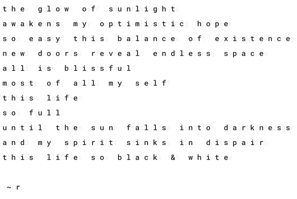
I love how you are playing with space with this piece. Visually, it’s striking. I am drawn into the poem, where the space between each letter is as prominent as the letter themselves. I also appreciate the duality you are speaking of here. It is amazing how life can shift so suddenly from the light of contentment to the darkness of forlornness in a single moment. Nice piece! I have read and reread this several times now before I felt prepared to comment, and that is what I love most about reading a Stover original.
Did you happen to click the sun/moon icon in the bottom right of the website? I fear this toggle is too subtle, and funny enough, the impetus for the whole poem! It took me a while to figure out how to hide two poems wrapped together using the dark/light reading mode plugin… Next time we are together I’ll have to share some of the dead-ends I went down before I found a method that worked.
Holy c0w! Boy, do I feel like a chump now. I saw the new toggle feature, and thought, “Oh, that’s a cool touch… It’s nice to see the website getting an update.” But then I proceeded to play with it in a manner akin to, “Bed goes up, bed goes down… Bed goes up, bed goes down.” I didn’t even notice the way you used to enhance your poem. But I love it! You are right that it is subtle, but the subtlety is what makes it so great. I love the idea of using technology to illustrate the theme of a poem, and the way you pull it together is fantastic. Very well done, and bonus points for creative formatting!